Key Takeaways
- The iPhone 18 lineup introduces Apple’s first foldable, the iPhone Duo, alongside the 18 Pro and Pro Max.
- The iPhone Duo focuses on seamless app transitions, fold-state awareness, and an almost invisible display crease.
- The 18 Pro and Pro Max bring the A20 Pro chip, improved thermal management, longer battery life, and a variable-aperture main camera.
- The Duo adds foldable design and a large inner display but makes trade-offs in cameras, biometrics, and price.
- Apple’s foldable experience shows how important adaptive app design is across different screen sizes and device form factors.
- The iPhone 18 lineup highlights how hardware innovation and mobile app development increasingly need to work together.
A hands-on look at what’s new, what’s improved, and what might make you think twice before upgrading.
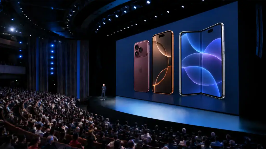
Apple just dropped three new iPhones, and for the first time in the company’s history, one of them folds in half.
If you’ve been waiting to see whether the iPhone 18 lineup is worth your attention, or your money, this breakdown covers everything that matters, straight from the hands-on review making the rounds this week.
Want to discuss your project? Our experts are just a click away.
Contact UsThe Headline Act: iPhone Duo, Apple’s First Foldable
Apple’s foldable era has officially begun. The iPhone Duo starts at $2,000, wears a titanium frame with a carbon fiber hinge, and folds down from a 5.4-inch outer display into a noticeably larger inner screen.
And here’s the thing, foldables have a reputation problem. The crease. That visible, distracting line running down the middle of every folding screen that reminds you you’re using a “compromise” device. Apple appears to have mostly solved it. The reviewer notes the crease is almost entirely invisible, setting a genuinely high bar for the rest of the foldable market.
How Apps Actually Behave on a Foldable Screen
A foldable phone lives or dies by its software, a stunning hinge means nothing if your apps look broken the moment you unfold it. iOS app developers of the Duo that Apple seems to have spent the most time getting right, and it’s worth unpacking in more detail.
The Cover Screen to Inner Screen Handoff
The core interaction of any foldable is simple in theory and hard in practice: you start something on the small outer display, then unfold the phone and expect it to just keep going on the bigger screen, not restart, not glitch, not awkwardly stretch. According to the hands-on review, this is exactly what happens here. Whatever you’re doing, reading a message, scrolling a feed, watching a video, carries over instantly and cleanly to the larger inner display the moment you open it, and the reverse happens just as smoothly when you fold it back up.
This sounds like a small thing until you’ve used a foldable where it doesn’t work well. Half-loaded layouts, apps that force-close on resize, or a jarring resolution jump are the kinds of rough edges that have plagued first-generation foldables from other manufacturers for years. The Duo’s software layer appears to paper over all of that.
Apps Actually Adapt, Not Just Stretch
The bigger interior display isn’t just “more of the same app, scaled up.” Based on the demoed behavior, apps reflow their layout to actually use the extra real estate, closer to how an app behaves on an iPad than a simple zoomed-in phone screen. That distinction matters: a poorly optimized foldable just stretches your phone UI across a bigger canvas, leaving awkward empty space or oversized buttons. A well-optimized one rearranges elements, think sidebars appearing, grids expanding from one column to two, or media players gaining extra controls, so the bigger screen genuinely feels like an upgrade rather than a novelty.
Orientation and Fold-State Awareness
The software also appears to be very aware of how the phone is being held, folded flat, partially opened into a “laptop mode,” or fully unfolded, and adjusts accordingly. That kind of fold-state awareness is what lets a phone like this pull double duty: quick glanceable use on the cover screen, and a more immersive, tablet-like experience once opened.
Where This Still Needs to Mature
To be fair to Apple, “seamless” doesn’t mean “perfect.” This is a first-generation foldable, and a few honest questions remain that a single hands-on can’t fully answer:
- Third-party app support: Apple’s own apps are one thing, how quickly will major third-party apps (social media, productivity, games) update to properly support the fold, versus just stretching their existing phone layout?
- Multitasking depth: Does the inner screen support true side-by-side multitasking (two apps at once), or is the extra space currently used one app at a time?
- Long-term consistency: Early demos tend to be curated. Whether every app in the App Store handles the transition this gracefully, not just the flagship ones shown off in a hands-on, is the real test over the coming months.
Even with those open questions, this software experience is arguably the single most important reason the Duo doesn’t feel like a science project. Apple didn’t just build a phone that folds, it built a phone whose software seems to understand that it folds, which is a much harder problem to solve.
What the Duo Gets Right
The inner display is something special. It uses a nano-texture coating that makes it dramatically less reflective than pretty much any other smartphone screen on the market, foldable or not. If you’ve ever fought with glare trying to read your phone outdoors, this is the kind of detail that actually changes daily use.
The software feels finished, not experimental. One of the hardest parts of building a good foldable isn’t the hinge, it’s making the software transition seamlessly between the small cover screen and the larger inner display. According to the review, Apple nailed the handoffs. Opening and closing the device, switching orientations, jumping between apps, it all feels fluid rather than janky, which is more than can be said for a lot of first-generation foldables from other manufacturers.
Battery life doesn’t disappoint. Despite the added complexity of a folding chassis, the Duo delivers between 31 and 44 hours of battery life depending on how you use it. That’s a genuinely impressive number for a device this mechanically complicated.
It even has MagSafe. Foldables and magnetic charging haven’t historically played nice together. The Duo is one of the rare few to pull it off successfully.
Durability holds up too. A titanium frame, carbon fiber reinforcement in the hinge, and, maybe most impressively, it retains an IP68 water resistance rating. That’s not something you’d expect from a device with a literal folding seam.
Where the Duo Falls Short
No first-generation product is without trade-offs, and the Duo has a few worth knowing about before you spend two grand:
- The outer screen skips the anti-reflective treatment that makes the inner display so good. So you get the premium experience only once you unfold it.
- The under-display selfie camera is weak. Hiding a camera beneath the screen is an impressive engineering feat, but the image quality takes a real hit as a result.
- There’s no telephoto lens. The Duo relies on just a main and ultrawide camera, a notable step down from what you get on the Pro models.
- Touch ID replaces Face ID. Because of the folding mechanism, Apple built authentication into the side button rather than using its usual Face ID system.
The verdict on the Duo, in short: it’s less a daily-driver replacement and more a luxury status symbol for early adopters who want to own a piece of Apple history, and are willing to pay a premium and accept a few compromises to get it.
What Popular Apps Actually Look Like on the Duo
Reading about fold-state awareness is one thing, seeing it in action across the apps people actually use every day is another. Based on the hands-on demo, here’s how a few familiar categories of apps behave as you move from the cover screen to the unfolded inner display:
Rideshare apps (Uber, Lyft)
On the 5.4-inch cover screen, a rideshare app behaves exactly like it does on any iPhone: map on top, request button pinned to the bottom. Unfold the phone mid-request, though, and the layout splits. The map expands to fill the left two-thirds of the screen while driver details, ETA, and trip options shift into a persistent sidebar on the right, closer to how these apps look on an iPad than a stretched phone screen.
Social and messaging apps (Facebook, Messages, Instagram)
Cover screen behavior stays familiar: a single-column feed or a chat thread, thumb-friendly and quick to check. Open the phone up, though, and social feeds gain a second column, letting you scroll your feed while a post stays expanded alongside it. Messaging apps go further, adopting a two-pane layout with your conversation list on the left and the open thread on the right, essentially turning your phone into a pocket-sized version of the messaging experience you’d get on a laptop.
Streaming and media apps
These see the most dramatic shift. On the cover screen, the video plays edge-to-edge, minimal and glanceable. Unfolded, the player shrinks slightly to make room for a persistent panel showing up next, comments, or episode lists, again mirroring iPad-style multitasking rather than a simple zoomed-in phone screen.
The throughline across all of these: nothing restarts, nothing stutters, and nothing just gets bigger for the sake of it. Apps reflow with purpose, adding structure (sidebars, panels, second columns) rather than padding, which is exactly the kind of adaptive behavior that separates a genuinely foldable-native app from one that’s simply been stretched to fit.
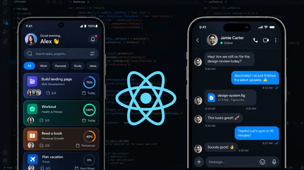
Now, an illustrative mockup of that cover-to-inner-screen transition:
That mockup illustrates the pattern described above: a generic rideshare-style app going from a single-column cover screen layout to a map-plus-sidebar layout once unfolded, which is representative of how Uber, Lyft, and similar apps would adapt.
The Reliable Workhorses: iPhone 18 Pro and Pro Max
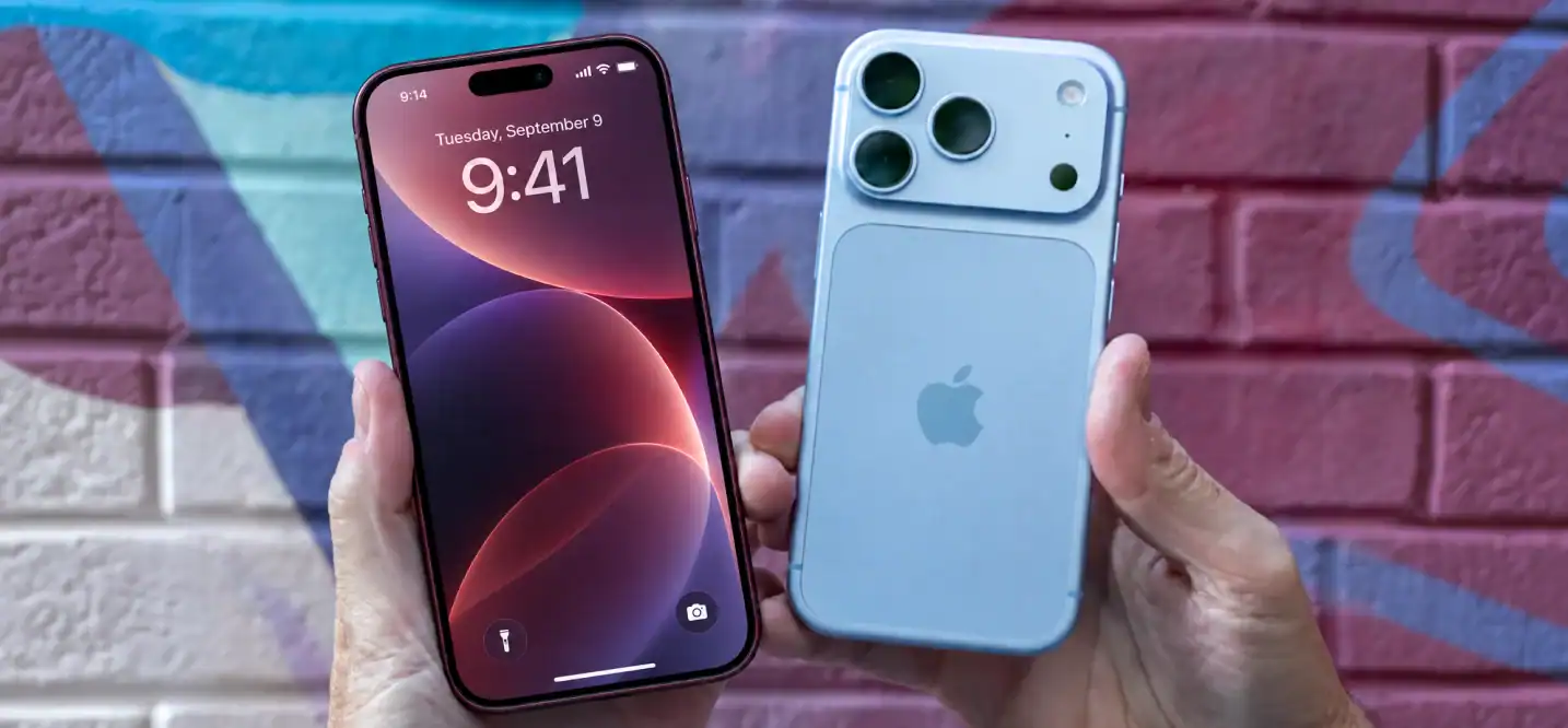
If the Duo is Apple flexing its engineering muscle, the iPhone 18 Pro and Pro Max are the phones actually built for most people’s everyday lives, and they got a genuinely substantial upgrade this cycle.
Design: Familiar, But Refined
At a glance, the 18 Pro looks a lot like last year’s iPhone 17, but pick it up and you’ll notice it’s heavier. The most visible design change is the Dynamic Island, which is now 35% narrower, freeing up more usable screen space without losing any of its functionality.
Performance: A Genuine Leap
Under the hood is where things get interesting. The new A20 Pro chip, built on a 2nm process, delivers up to 40% faster performance than its predecessor. Just as important, Apple paired it with a larger vapor chamber for improved thermal management, meaning that performance boost doesn’t come at the cost of your phone turning into a hand warmer during a long gaming session.
Battery: The Best Yet
The Pro Max in particular takes a massive step forward, now rated for up to 45 hours of battery life, a significant jump over previous generations and enough to comfortably get most users through more than a full day of heavy use.
Camera: Manual Control Comes to iPhone
This might be the most exciting update for photography enthusiasts: the main camera now features a variable aperture. In plain terms, that means you get real manual control over how much light enters the lens, directly impacting depth of field and background blur (aka that dreamy bokeh effect). It’s the kind of control that’s historically been reserved for dedicated cameras, now built directly into your iPhone.
Unlike the Duo, the Pro and Pro Max also retain the full triple-camera system, including the telephoto lens, a key differentiator if photography is a priority for you.
Duo vs. Pro: Which One Actually Makes Sense?
Here’s the side-by-side breakdown:
| iPhone Duo | iPhone 18 Pro / Pro Max | |
| Starting Price | $2,000 | $1,199 |
| Form Factor | Foldable, titanium + carbon fiber | Traditional solid body |
| Display | 5.4″ outer, larger inner, near-invisible crease | Standard display, 35% narrower Dynamic Island |
| Cameras | Main + Ultrawide only, weak selfie camera | Main, Ultrawide, and Telephoto + variable aperture |
| Biometrics | Touch ID (side button) | Face ID |
| Chip | – | A20 Pro (2nm, up to 40% faster) |
| Battery | 31–44 hours | Up to 45 hours (Pro Max) |
| Best For | Early adopters, status seekers | Everyday users, photography-focused buyers |
The pattern here is pretty clear. The Duo is Apple showing off what’s possible, a genuinely impressive piece of engineering that asks you to pay a premium and accept some real trade-offs (weaker selfie camera, no telephoto, pricier by nearly double) in exchange for owning something new and different.
The 18 Pro and Pro Max, meanwhile, are the safer, smarter bet for almost everyone. You’re getting the best iPhone camera system Apple has ever shipped, a genuine performance leap with the A20 Pro chip, the best battery life in iPhone history, and a design that, while familiar, has been meaningfully refined.
The Bottom Line
Apple didn’t just release a new iPhone this year, it released a statement. The Duo proves the company can build a foldable that doesn’t feel like a compromise in the ways that matter most (crease, software, durability), even if it still has some rough edges to smooth out in future generations.
But for the vast majority of people reading this, the iPhone 18 Pro or Pro Max is where the real value lives: a faster chip, a genuinely more capable camera system, and the longest battery life Apple has ever put in a phone, all starting at a price that doesn’t require a second mortgage.
It’s also a reminder of just how much innovation is happening on the software side of mobile, not just the hardware. Foldables like the Duo only work because of the engineering behind the apps running on them, and that’s exactly the kind of challenge specialized mobile app development services are built to solve, designing experiences that adapt intelligently across screen sizes and form factors.
For companies looking to stay ahead of shifts like this, investing in solid iOS app development for business is quickly becoming less of an option and more of a necessity. Whichever one you’re eyeing, one thing is certain: this is the most interesting iPhone lineup Apple has shipped in years.
Want to discuss your project? Our experts are just a click away.
Contact UsFrequently Asked Questions
1. Is the iPhone Duo Apple’s first foldable iPhone?
Yes. The iPhone Duo is presented as Apple’s first foldable iPhone, with a 5.4-inch outer display that opens into a larger inner screen.
2. How do apps work on the iPhone Duo?
Apps can transition between the cover and inner displays without restarting. They can also reflow their layouts to use the larger screen, adding elements such as sidebars, grids, and extra controls.
3. What is the difference between the iPhone Duo and iPhone 18 Pro?
The Duo has a foldable design and larger inner display, while the 18 Pro uses a traditional phone design. The Pro also has a triple-camera system with a telephoto lens, while the Duo has a main and ultrawide camera.
4. How much does the iPhone Duo cost?
The iPhone Duo starts at $2,000, while the iPhone 18 Pro and Pro Max start at $1,199 according to the comparison in the article.
5. Does the iPhone Duo have a Face ID?
No. The Duo uses Touch ID built into the side button instead of Face ID.
6. What camera features does the iPhone 18 Pro have?
The iPhone 18 Pro and Pro Max feature a main camera with variable aperture and retain a triple-camera setup that includes a telephoto lens.
7. Why does adaptive app design matter for foldable phones?
Foldable phones have different screen sizes and fold states, so apps need to adjust their layouts instead of simply stretching the same interface. Adaptive design can help apps provide a more natural experience as users open, close, or reposition the device.